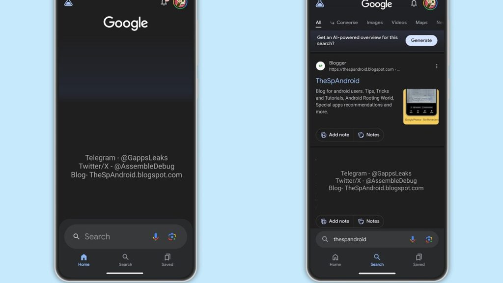
Google seems to be experimenting with a new interface for its search app on Android. It moves the primary search bar from the top of the screen to the bottom.
According to AssembleDebug, the company has enabled a hidden flag in a recent beta version of the Google app that places the search bar at the bottom. Screenshots of the updated interface show the search box sitting directly above the bottom navigation bar.
The query automatically populates in the lowered search bar when an active search is underway. The rest of the search interface, such as filters, sections, and account options, remain at the top of the screen. Only the search bar itself has been relocated.
AssembleDebug reported finding this bottom search bar option in Google app version 14.48.26.29.arm64 while investigating hidden features. However, it’s unclear if the change will be rolled out more widely or just an experiment. Google often tests interface tweaks without fully implementing them.
With Google now offering a bottom address bar option on Chrome for iOS as well, extending this design to more Android apps seems possible. A bottom search bar could make Google’s core search functionality more accessible for today’s larger smartphones.
This wouldn’t be Google’s first foray into bottom navigation. The company previously experimented with moving the address bar to the bottom of Chrome for Android but eventually stopped the test. Other browsers like Firefox have adopted bottom navigation bars, though.
For now, the new bottom search bar in the Google app remains an obscure flag-enabled feature. But it provides an early glimpse at how Google may rethink touchscreen interfaces.
In other news, Google has added a new feature to Search designed to give users the latest information on specific topics they are interested in. The new feature is called Follow.

