In 2021, Microsoft announced it was planning to replace Calibri as the default font for its Office productivity apps. It presented the public with five competing fonts (Tenorite, Bierstadt, Skeena, Seaford, and Grandview) and asked them to vote for their favorite via Twitter polls, online feedback, and more. Today, Microsoft Design announced the winner.
On its Medium page, Microsoft Design stated that the winning font was . . . Bierstadt! However, Microsoft decided to give the winning font a name change, so the new default Office font is now called . . . Aptos!
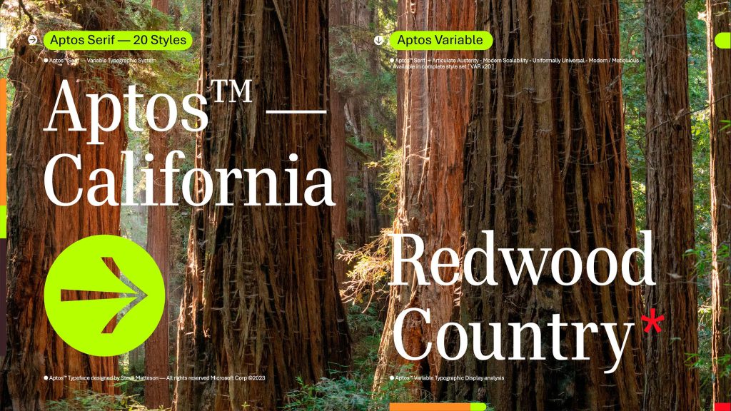
The font itself was created by Steve Matteson who previously worked on the original Windows TrueType core fonts and also created the Segoe font. It was made to work better on higher-definition displays. The name Aptos was also Matteson’s idea, as it comes from an unincorporated town in the Santa Cruz area of California that is one of his favorite destinations.
The Medium post stated:
Similar to mid-20th-century Swiss typography, Aptos is a sans serif. Also referred to as Grotesque or Gothic, sans serif often have simple letterforms, even strokes, and they’re easily readable. Aptos, made of varying geometric shapes, is bold, well-defined, directive, and constrained. It articulates many different languages and tones. Stem ends are clean cut. Subtle circular squares within the letters’ contours allow higher legibility, especially at small sizes.
The post also goes into some specific details about some of the letters in the Aptos font:
Now the lowercase l has a distinctive tail, separating it from the capital I. The heads of i’s and j’s are circular dots as opposed to grotesque squares. 6 is single stroked while two piled ellipticals make 8.
The four losing fonts will still be added to Microsoft’s Office apps as optional selections. The Aptos font will also be available under its original Bierstadt name as yet another option. There’s also a new font menu that is currently available for web users that will still include Calibri as a pre-pinned font at the top.

